I talked about the Open Web Mind right back in the first Tangled Web article.
I haven’t mentioned it since.
The Open Web Mind is my most ambitious project.
It’s what I work on when I’m not writing articles or recording podcasts.
It’s so ambitious that it’s difficult to know where to start when talking about it.
When I talk expansively to my friends about what the Open Web Mind could be, they come away confused about what it is.
So I’m going to start small and specific.
Today, I’m going to avoid talking expansively.
That’s going to be difficult. There are so many big-picture things I could expand on here. And eventually I will expand on them.
But today, I’m going to keep myself in check.
I’m going to talk about a visualization I generated with the Open Web Mind.
This one small, specific thing represents a tiny fraction of what the Open Web Mind could be, but I’m hoping it’ll be a less confusing introduction to what it is.
Too many words
There’s a lot of information on the web... as you might have noticed.
When I say a lot of information, I mean a lot of information.
Trouble is, there’s not much you can do with it.
You can search for it: type anything into Google, and it’ll come up with countless links to pages on that subject.
You can read it: follow any of those links, and you’ll be able to read countless words on that subject.
You can share it: copy one of those links, email it to a friend or post it on social media, and others will be able to read those words, too.
But that’s about all you can do.
Read.
Words.
I mean, there are images, too, and videos, and so on.
But really, the information on the pages of web sites is not much different from information on the pages of library books.
More than words
Take this report, as an example: the Global Startup Ecosystem Report 2021 from Startup Genome.
There’s an amazing amount of information in its 290 pages.
You can read it.
But that’s about all you can do.
Read.
Words.
What if you don’t have time to read all 290 pages?
What if you want to do more than just read?
Turning the tables
One of the tables in the report is a ranking of the top 40 startup hubs in the world.
Now that’s interesting.
Which are the most important startup hubs?
Where in the world are they?
Are they all in the US? China? Europe?
Are there any in South America? Australia? Africa?
All this information is in the report.
You can find it by reading it.
You’ll also have to do a bit of thinking about it.
And you’ll have to do a bit of visualizing too.
That table I mentioned, it doesn’t list the startup hubs by continent, much less show them on a map, so you’ll have to picture in your head which startup hub is where.
That’s a lot of mind work
Wouldn’t it be good if someone had done the reading, the thinking and the visualizing for you?
Wouldn’t it be good if, when you came across this report, you saw not just words, but a visualization of where the top 40 startups hubs are in the world?
Something like this:
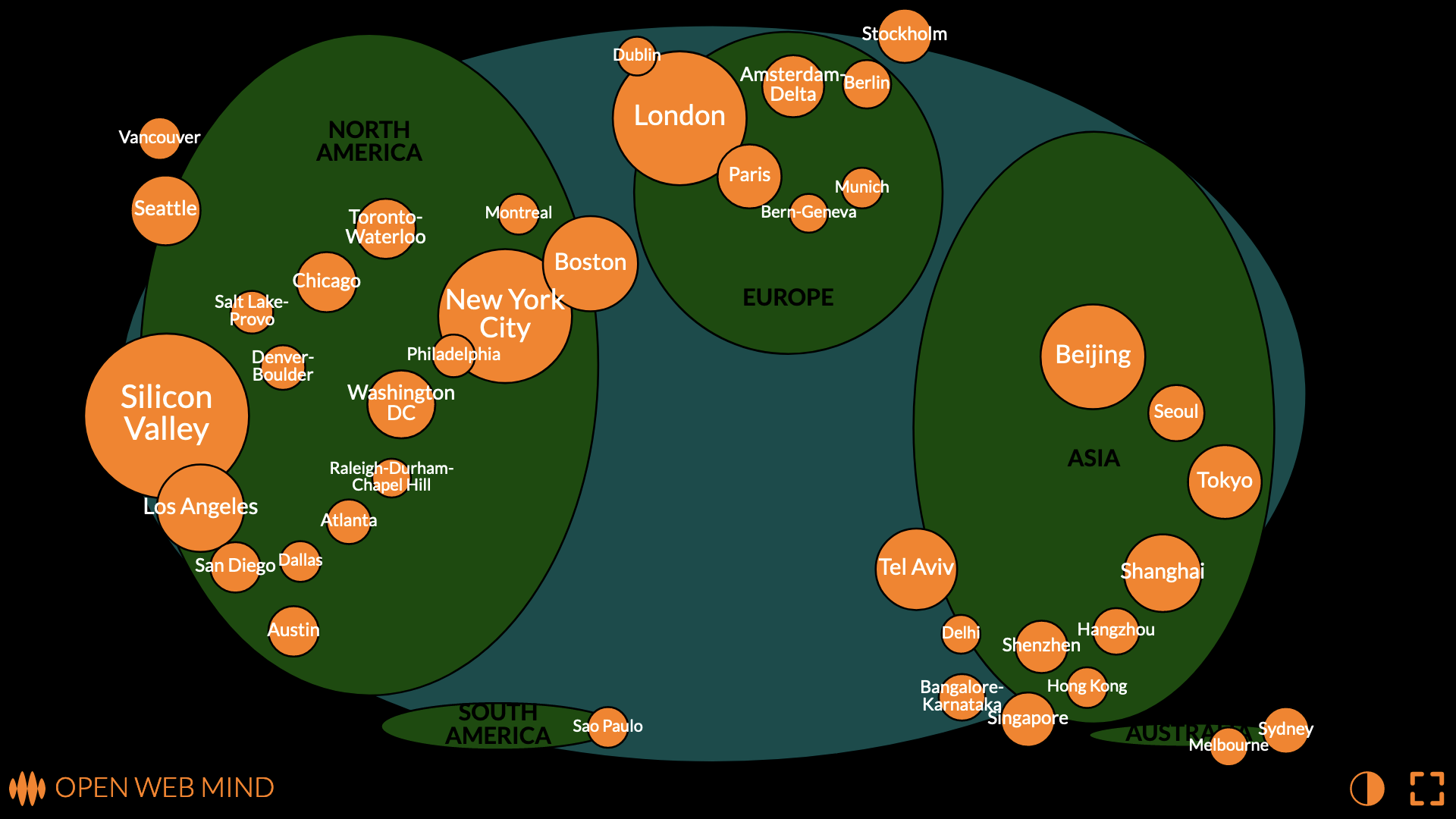
I recently posted this visualization of Startup Genome’s top 40 startup ecosystems on things made thinkable.
You can see what I’ve done here. The top 40 startup hubs are shown as circles. The bigger the circle, the more important the startup hub.
Instead of being listed in a table, the startup hubs are shown in their relative positions around the world. The continents are shown, too, to give a better idea of how the startup hubs are distributed. And the map is deliberately distorted so that the startup hubs are spread out enough to see them all without too much overlap.
Now I see
The visualization communicates a lot of information.
You can see that the US has a lot of important startup hubs, with Silicon Valley and New York City leading the pack. There are a few in Canada too. This makes North America the biggest continent for startup hubs.
There are plenty of important startup hubs in China, too, and elsewhere in Asia: India has two; Singapore is another one.
Europe is lagging a little, with London dominating.
Australia is on the map, with two top-40 startup hubs, as is South America, with one, but Africa isn’t on the map, yet.
This is not as much information, of course, as you’d get if you read all 290 pages of the report.
But, well, that’s the point: you don’t have to read all 290 pages of the report.
I’ve done that for you. I pulled out the really important information from all those words and presented it visually, so that you can get it all in a glance. I did the mind work so that you don’t have to.
What I actually did
OK, I admit, I didn’t read all 290 pages of the report. I read the most relevant parts of the methodology, but not the whole thing.
Here’s what I actually did.
I fed the rankings from that table into the Open Web Mind.
I also fed the coordinates of each of the startup hubs from Wikipedia into the Open Web Mind.
Then I asked the Open Web Mind to generate the visualization.
It’s not a map, specifically. It’s more general than that. It’s a flexible plot of longitude on the x-axis, latitude on the y-axis, and rank on the size axis.
That’s a very complicated way of saying what I’ve already said: the visualization shows the top 40 startup hubs as circles, the bigger the circle, the more important the startup hub, in their relative positions around the world, deliberately distorted so that they’re spread out enough to see them all.
The point is, I didn’t have to do anything special to generate this visualization, I just fed the data into the Open Web Mind and out came the map.
Someone... or something
What if you didn’t need me to do that for you?
Imagine if whenever you came across, say, a 290-page report, or anything else on the web, you had someone to make sense of it for you, someone to transform all those words into information you can do something with, someone to generate a meaningful visualization.
Someone... or something.
Something like the Open Web Mind.
Early days of the mind
Maybe you can begin to see where I’m going with this.
The web is in the wrong format. It’s in words. Same as printed books. Same as penned manuscripts. Same as carved tablets.
It’s as if it’s a few thousand years behind the times.
However, all is not lost. The Open Web Mind can read those words and transform them into a more flexible format. It can transform them into concepts, and connections between concepts, much the same as neurons, and connections between neurons, in the human brain.
The Open Web Mind can transform words on the web into information you can do something with: knowledge you can query, navigate, manipulate, visualize.
I could say more, but I’m already breaking my promise to avoid talking expansively.
So I’ll leave it at this, for now: the Open Web Mind allowed me to transform a table from a 290-page report into a visualization of startup hubs around the world.
Not bad, for these early days of the mind.